Imagine walking into a wedding reception, confused, scanning the room for your name. The escort cards are stacked on a table, tiny font, dim lighting, and half of them are tucked behind a vase. You’re not alone-this happens more than you think. Wedding escort cards aren’t just decorative; they’re the first step in guiding guests to their seats. If they’re hard to read or poorly placed, people feel lost, frustrated, or even excluded. That’s not the vibe you want on your big day.
Why Accessibility Matters More Than You Think
Weddings bring together people of all ages, abilities, and backgrounds. Some guests might be older and need larger text. Others might have low vision, color blindness, or even temporary issues like tired eyes after a long flight. If your escort cards rely on fancy script fonts or pastel ink on cream paper, you’re not being inclusive-you’re creating a barrier.
A 2024 survey by the Wedding Accessibility Network found that 38% of guests over 55 reported difficulty reading standard escort cards. That’s nearly four in ten people struggling to find their table. And it’s not just about age-people with dyslexia, low contrast sensitivity, or even just poor lighting in a venue can’t make out what’s written. Accessibility isn’t a trend. It’s basic hospitality.
Font Size and Style: The Rules That Actually Work
Forget elegant cursive. For escort cards, legibility beats aesthetics every time.
- Use a minimum font size of 14 point. Anything smaller is risky, especially under low lighting.
- Choose clean, sans-serif fonts like Arial, Helvetica, or Open Sans. These are designed for easy reading at a glance.
- Avoid all caps. Text in ALL CAPS is harder to read because it removes word shape cues that help our brains recognize words quickly.
- Use bold for names, not italics. Italics can blur together, especially in small sizes.
One couple in Perth printed their escort cards on 120gsm matte cardstock with 16-point Helvetica Bold for names and 12-point for table numbers. Guests told them afterward that they could read the cards from two steps away-even without glasses. That’s the standard you want.
Color Contrast: Don’t Make People Squint
White text on ivory? Black on navy? These might look chic in a magazine, but they’re accessibility nightmares.
The Web Content Accessibility Guidelines (WCAG) recommend a contrast ratio of at least 4.5:1 for small text and 3:1 for large text. For escort cards, where names are the key element, aim for 4.5:1 or higher.
Here’s what works:
- Dark charcoal on white or cream
- Deep navy on pale gold
- Black on soft blush (if the blush is light enough)
Use a free tool like WebAIM’s Contrast Checker to test your color combo before printing. If you can’t tell the difference between your text and background in a dimly lit room, your guests won’t be able to either.
Placement: Where to Put Them So No One Gets Lost
Where you put the cards matters as much as how they look.
Don’t put them on a side table near the bar. Don’t tuck them behind flowers. Don’t scatter them across three different stands. Guests should know exactly where to go the moment they walk in.
Best practices:
- Place escort cards in a single, clearly marked area near the entrance-ideally where guests naturally pause to check their phones or hand coats.
- Use a dedicated stand or table with a clear sign: "Your Table Assignment" or "Find Your Seat Here."
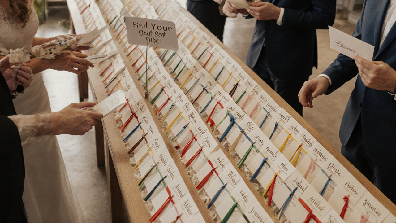
- Group cards alphabetically by last name. Alphabetical order is the most intuitive system for most people.
- If you have over 100 guests, divide them into sections: A-F, G-L, M-R, S-Z. Use colored ribbons or small signs to separate each group.
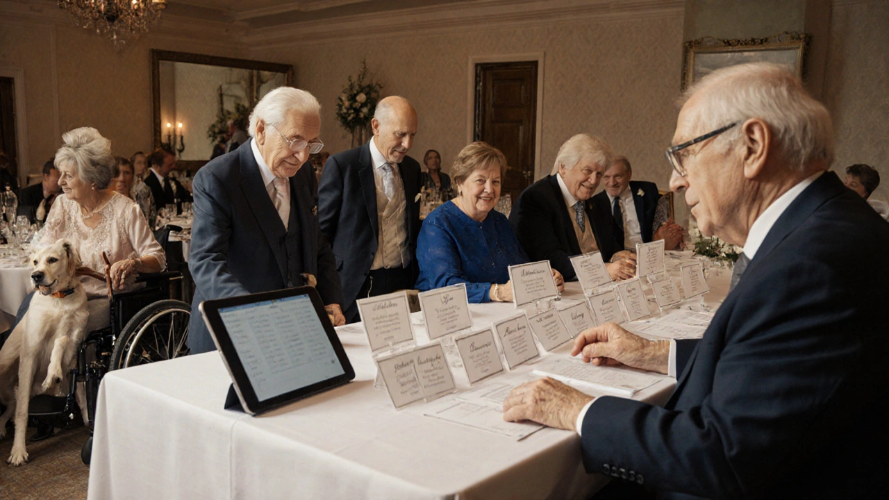
- Include a digital backup. Have a tablet or printed list at the host’s table for guests who still can’t find their name.
One wedding planner in Melbourne added a small mirror behind the escort card display. Guests could check their outfit while finding their seat-practical, thoughtful, and memorable.
Alternative Formats for Inclusivity
Not everyone reads paper cards. Some guests might be visually impaired, non-native speakers, or simply forgetful.
Here’s how to cover all bases:
- Offer braille escort cards for guests who request them. A local print shop in Perth can produce these for under $5 each.
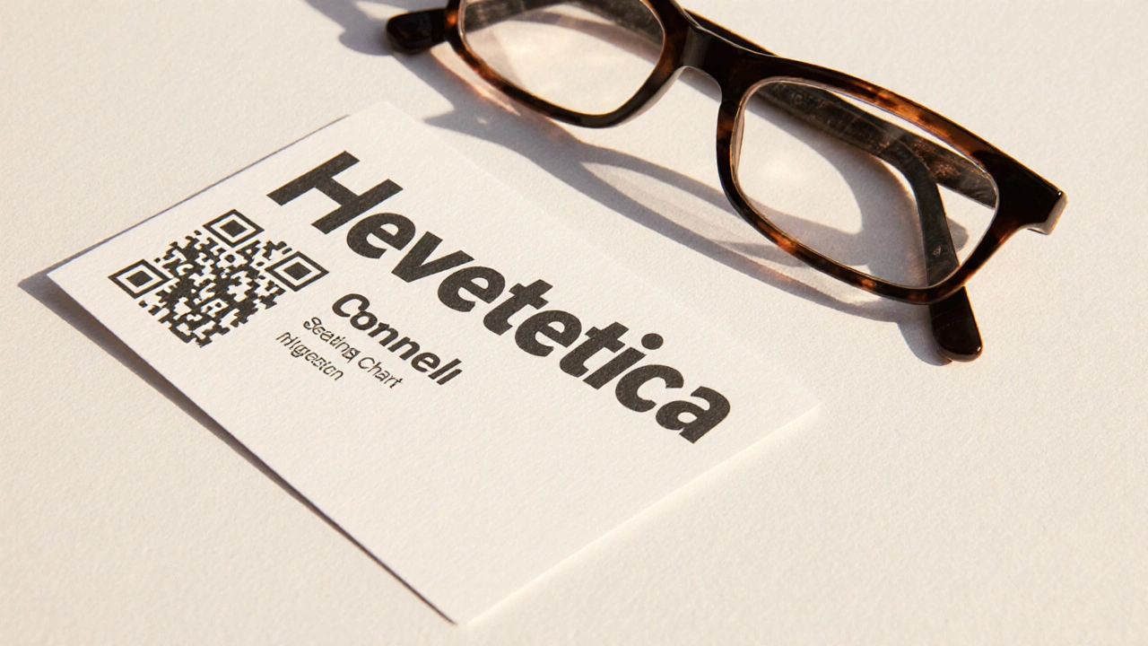
- Include a QR code on each card that links to a simple webpage listing names and tables. Guests can scan it with their phone if the text is too small.
- Send a digital version of the seating chart via email or text a day before the wedding. Add a note: "Need a large-print version? Reply and we’ll send it right away."
- Have a volunteer stationed near the cards to quietly guide anyone who looks unsure. No one likes to ask for help-make it easy.
Real-World Example: A Wedding That Got It Right
A couple in Fremantle hosted a wedding with 140 guests. Their escort cards were printed on thick, matte recycled paper with 16-point Arial Bold. Names were in deep brown, table numbers in soft gold. The cards were arranged in four color-coded sections (red, blue, green, yellow) on a long wooden table with a simple sign: "Find Your Name. Find Your Table."
They also emailed a digital seating chart with a toggle for "Large Print" and included a braille version for one guest. At the end of the night, five guests pulled them aside to say how easy it was to find their seat. One said, "I didn’t have to ask anyone. That meant a lot."
Common Mistakes to Avoid
Even well-intentioned couples make these errors:
- Using metallic ink-too shiny, causes glare, unreadable under lights.
- Printing names on the back of the card-guests turn it over and still can’t find their table.
- Putting cards on a high shelf or hanging them from a ceiling-impossible for wheelchair users or children.
- Forgetting to include table numbers clearly-guests find their name but have no idea where to sit.
- Waiting until the day before to print-last-minute changes mean typos, and typos cause chaos.
Test your cards. Print a sample. Hold it at arm’s length. Walk into a dim room. Ask someone who wears glasses to read it. If it’s still a struggle, redesign it.
Final Thought: It’s Not Just About Looks
Your wedding day is about connection. The escort card is a tiny moment-but it’s the first time your guests interact with your event. If they feel welcomed, seen, and guided, they’ll carry that feeling into the night.
Accessibility isn’t about checking a box. It’s about designing with care. It’s about making sure everyone, no matter their eyesight, age, or background, can find their place without stress.
When you get the details right, people don’t notice the effort. They just feel at home.
What’s the minimum font size for wedding escort cards?
Use at least 14-point font, but 16-point is ideal for maximum readability. Names should be bold and in a clean sans-serif font like Arial or Helvetica. Anything smaller risks being unreadable, especially in dim lighting or for older guests.
Should I use script fonts for wedding escort cards?
Avoid script or decorative fonts for names. They’re harder to read quickly and can be confusing for people with dyslexia or low vision. Stick to simple, bold sans-serif fonts. Elegance comes from clarity, not complexity.
How do I check if my color contrast is accessible?
Use the free WebAIM Contrast Checker. Enter your text and background colors-it will tell you if the contrast meets the 4.5:1 standard for small text. If you’re unsure, go darker on light or lighter on dark. High contrast is always safer.
Where’s the best place to put escort cards at a wedding?
Place them in one clear, visible spot near the entrance-ideally where guests naturally stop. Use a dedicated stand with a clear sign like "Find Your Seat Here." Group cards alphabetically and use color-coded sections for large guest lists. Avoid placing them behind decorations or on high shelves.
Do I need to provide braille escort cards?
Only if a guest requests one. But it’s thoughtful to mention in your RSVP request: "Let us know if you need a large-print or braille version of the seating chart." This shows you’re prepared without assuming needs. Local print shops can produce braille cards affordably.
Can I use QR codes on escort cards?
Yes, and it’s a smart addition. A QR code linking to a simple digital seating chart gives guests another way to find their table-especially helpful if the printed card is hard to read. Make sure the link works, the page loads fast, and it’s mobile-friendly. Include the table number on the card too-QR codes shouldn’t replace text, just support it.