When you’re planning a wedding with guests who speak different languages, your escort cards aren’t just directional signs-they’re the first quiet moment of inclusion. A well-designed bilingual escort card tells guests, you belong here, no matter which language they speak first. But getting the typography and language right isn’t just about translation. It’s about rhythm, respect, and readability.
Why Bilingual Escort Cards Matter
Imagine a guest walking into your reception. They scan the table names, searching for their name. If the card is only in English, and their first language is Mandarin or Spanish, they might feel lost. Or worse, they might assume they weren’t thought of. Bilingual escort cards solve this. They don’t just guide people to their seats-they make people feel seen.
According to wedding planners who work with multicultural couples, 68% of guests at bilingual weddings say they noticed and appreciated the effort to include their language on seating cards. That’s not just polite-it’s powerful. It turns a simple function into a cultural gesture.
Choosing Which Languages to Include
Don’t try to translate into every language spoken by your guests. That turns your escort cards into a cluttered mess. Instead, pick the two most common languages among your attendees. If your family speaks Spanish and your partner’s side speaks Mandarin, those are your two. If half your guests are French-speaking and the rest are English-speaking, go with those.
Here’s a simple rule: use the language your parents speak, the language your partner grew up with, or the language most of your guests use daily. Avoid including languages just because they sound "exotic." Authenticity beats aesthetics every time.
Layout: Side by Side or Stacked?
There are two clean ways to lay out two languages on a single card.
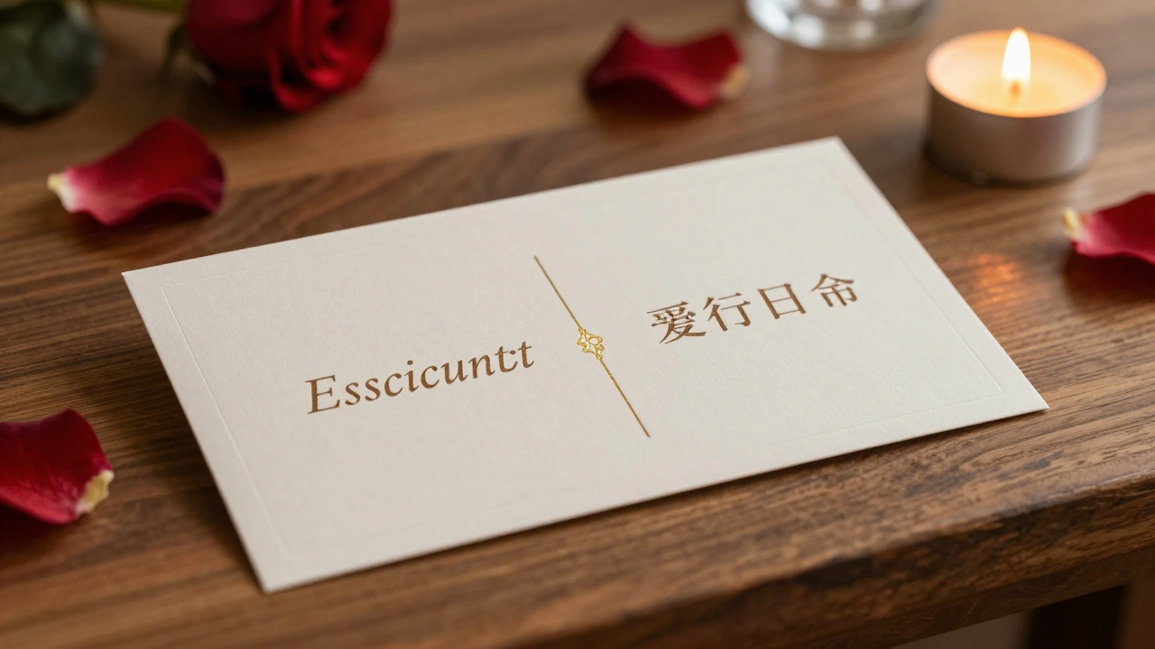
- Side by side: Best when both languages have similar word counts. Place English on the left, the other language on the right. This mirrors how people read in most Western cultures. Use a thin vertical line or a small icon (like a globe or interlocking rings) to separate them visually.
- Stacked: Better when one language is longer. Put the primary language on top-usually the one you speak at home. Then the second language below, slightly smaller but still legible. This works well if one language uses a non-Latin script like Arabic, Cyrillic, or Chinese characters.
Never put one language on the back of the card. Guests won’t flip it. They’ll just walk away confused.
Typography That Works for Both Languages
Choosing fonts is where most people stumble. You can’t just pick two pretty fonts and call it a day. Some fonts don’t support special characters. Others look great in English but turn into blobs in Japanese or Arabic.
Here’s what actually works:
- Use fonts with full Unicode support. Google Fonts like Noto Sans covers over 1000 languages-including Thai, Armenian, and even Cherokee. It’s free, clean, and designed to look consistent across scripts.
- Avoid decorative scripts. Fancy cursive fonts like “Brush Script” or “Lobster” might look romantic in English, but they’re unreadable in Devanagari or Hangul. Stick to sans-serif for clarity.
- Match the weight. If your English text is medium weight, make sure the second language is the same. A bold English line next to a thin Chinese line looks unbalanced.
- Test the spacing. Some languages need more room between characters. Korean and Arabic, for example, often look cramped if you use the same letter-spacing as English. Increase it by 5-10% for those scripts.
Pro tip: Print a test card. Hold it up to the light. If you squint and can’t tell which language is which, it’s too similar. Make one stand out slightly-maybe by using a slightly darker shade or a different line height.
Names and Titles: How to Handle Them
Names don’t always translate. Your guest’s name might be “Maria” in English and “María” with an accent in Spanish. Or “李伟” in Chinese. Don’t anglicize names. Use the exact spelling your guest uses in their daily life.
For titles like “Mr.” or “Ms.,” here’s what to do:
- Use the title only if it’s culturally expected. In many East Asian cultures, titles are rarely used on personal stationery.
- If you must include them, use the most neutral version. “Mr.” and “Ms.” are fine for English. For French, use “M.” or “Mme.” For German, “Herr” or “Frau.”
- When in doubt, skip titles entirely. Just use the full name.
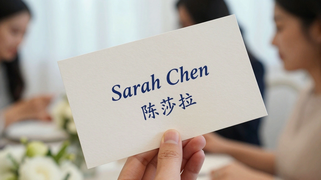
Example:
English: Sarah Chen
Chinese: 陈莎拉
Notice how the Chinese version uses the family name first-this is correct. Don’t reverse it to “莎拉陈.” That’s a common mistake.
Color, Paper, and Texture
Color should reflect your wedding palette, not your language. But here’s a subtle trick: use the same color for both languages. If you print English in navy and Chinese in black, it feels like one is an afterthought. Use identical ink.
Paper matters too. Thick cardstock (300gsm or higher) feels luxurious and holds up better to handling. Avoid glossy finishes-they reflect light and make non-Latin scripts harder to read. Matte or soft-touch finishes are better.
Consider texture. A subtle embossed border or a single line of foil stamping (in gold or silver) can tie both languages together without adding visual noise.
Common Mistakes to Avoid
- Using Google Translate without a native speaker. “Welcome” in French is “Bienvenue.” But “Welcome to our wedding” doesn’t translate cleanly to “Bienvenue à notre mariage.” The correct phrase is “Nous vous invitons à notre mariage.” Always have a native speaker review the text.
- Putting the wrong script on the wrong side. Arabic reads right-to-left. If you put Arabic on the left, it looks broken. Put it on the right. Same for Hebrew.
- Forgetting punctuation. Spanish uses inverted question marks and exclamation points. Chinese doesn’t use spaces between words. Missing these breaks the flow.
- Using fonts that don’t support diacritics. If your guest’s name is “José,” and your font doesn’t support the accent, it’ll show up as “Jose.” That’s not just wrong-it’s disrespectful.
Where to Print and What to Expect
Most online stationery shops (like Minted, Paperless Post, or local print studios) offer bilingual templates. But don’t just pick the first one you see. Ask them: “Does your template support full Unicode for [language]?” If they hesitate, move on.
Expect to pay 20-40% more for bilingual cards. That’s because of custom typesetting, proofing, and printing two scripts on one card. But it’s worth it. A printed card lasts longer than a digital message. And guests keep them.
Order at least 6 weeks in advance. Proofing bilingual text takes time. You’ll need at least two rounds of edits-one for each language.
Final Thought: It’s Not Just a Card
Your escort card is the first thing guests interact with after walking into your celebration. It’s the first signal that this day was built with care-for everyone.
When you get the language right, when the font feels balanced, when the paper catches the light just right-it doesn’t just guide someone to their seat. It says, this is your table too.
Do I need to include both languages on every escort card?
Yes. Every card should have both languages. Mixing single-language cards creates confusion and can make some guests feel excluded. Consistency is key-even if one language is longer, make sure each card has both versions clearly visible.
Can I use a third language if I have many guests who speak it?
Only if it’s spoken by at least 20% of your guests. Otherwise, it’s better to keep it to two. Too many languages make the card look cluttered and hard to read. If you have a large group speaking a third language, consider adding a small bilingual sign near the seating area with the third language, or include it in your digital wedding app.
What if one language uses a non-Latin script like Chinese or Arabic?
That’s fine-but you need a font that supports it. Noto Sans is the most reliable. Avoid decorative fonts entirely. Make sure the script is printed clearly and with enough space. Arabic and Hebrew read right-to-left, so place them on the right side of the card. For Chinese, Japanese, or Korean, use a clean sans-serif font with proper character spacing.
Should I translate the table names too?
Only if your table names are in one language. If you name tables after cities (Paris, Tokyo, Bali), no translation is needed-those are universal. But if you use names like “The Garden” or “The Willow,” and your guests don’t speak English, consider translating those too. Keep it simple: “Jardín” for Spanish, “花园” for Chinese.
How do I make sure the names are spelled correctly in the second language?
Ask the guest. Don’t rely on automated tools. Send a quick message: “Hi, just confirming your name on the escort card-should it be ‘José’ or ‘Jose’? And how should it appear in [language]?” Most people will appreciate the thoughtfulness. This also helps avoid embarrassing mistakes, like misspelling a family name.