Wedding escort cards aren’t just pretty little tags-they’re the quiet roadmap that guides your guests from the ceremony to their table. If your seating chart is carefully planned but your escort cards look like they were printed on a home printer at 2 a.m., you’re missing a chance to tie the whole experience together. The goal isn’t just to tell someone where to sit. It’s to make them feel like the details were thought of just for them.
Start with Your Seating Chart First
Don’t design your escort cards before you’ve finalized your seating chart. That’s like printing invitations before you’ve picked the date. Your seating chart determines everything: how many cards you need, the layout of names, and even the size and shape of the cards. If you’re seating 120 guests across 12 tables, you’ll need 120 cards. Simple math, but people skip this step and end up with mismatched sets or last-minute scrambling.
Use a spreadsheet or a free tool like AllSeated or WeddingWire’s Seating Planner. These let you drag and drop names onto tables. Once you’re happy, export the list. You’ll use this exact list to create your escort cards. No guessing. No typos. No confused Aunt Carol wandering the reception looking for Table 7.
Match the Style, Not Just the Color
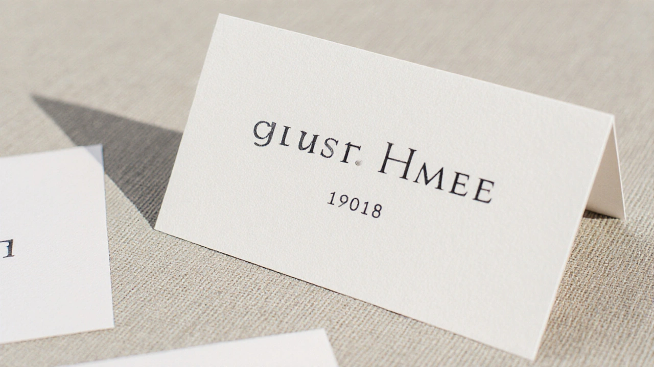
Many couples think matching escort cards means using the same color as their invitations. That’s a start-but it’s not enough. You need to match the style. If your invitations have gold foil lettering and hand-lettered script, your escort cards should too. If your theme is minimalist with sans-serif fonts and crisp white paper, your cards should follow suit.
Look at your invitation suite as a whole. What’s the texture? Is it matte? Embossed? Does it have a border? Edge painting? If your invites have a subtle linen finish, get your escort cards printed on the same paper. If your thank-you notes use a custom monogram, use the same one on the cards. Consistency doesn’t mean repetition-it means cohesion.
Use the Same Font Hierarchy
Fonts carry tone. If your main invitation uses a bold serif for the couple’s names and a delicate script for the details, your escort cards need the same balance. Don’t switch to Comic Sans on the cards just because it’s easier to read. That breaks the spell.
Here’s a simple rule: use two fonts max. One for the guest’s name, one for the table number. The guest’s name should be the largest and most prominent. Table number should be smaller but still easy to spot from across the room. If your invitations use Playfair Display for names and Lora for details, use the same pairing. Even if your designer says, “It’s just a card,” the brain notices the difference. And guests remember it.
Layout Matters More Than You Think
There are three common layouts for escort cards: single-sided, double-sided, and folded. Each has trade-offs.
- Single-sided: Name on front, table number on back. Simple. Cheap. Works if you’re using a card stand and guests can flip them easily.
- Double-sided: Name on one side, table number on the other. Best for flat placement on tables or in a display tray. No flipping needed.
- Folded: Looks like a mini invitation. Can include a short message or quote. More expensive, but feels luxe. Great for formal weddings.
If you’re using a long table with cards placed in a row, go double-sided. Guests don’t want to walk up, pick up a card, flip it, and then realize they’re at the wrong table. If you’re using a wooden stand with cards leaning forward, single-sided works fine. Just make sure the table number is big enough-14-point font minimum.
Place Cards vs. Escort Cards: Know the Difference
Some people use the terms interchangeably, but they’re not the same. A place card sits at the exact seat-usually with a name and table number, sometimes with a menu or seating number. An escort card tells guests which table to go to, but not which chair. Guests find their table first, then find their seat.
If you’re doing escort cards, you’re giving guests a bit of freedom. That’s great for casual weddings. But if you have a large group with kids, elderly guests, or people who get anxious about seating, place cards reduce stress. You can even do both: escort cards for the table, then place cards at each seat for VIPs or family.
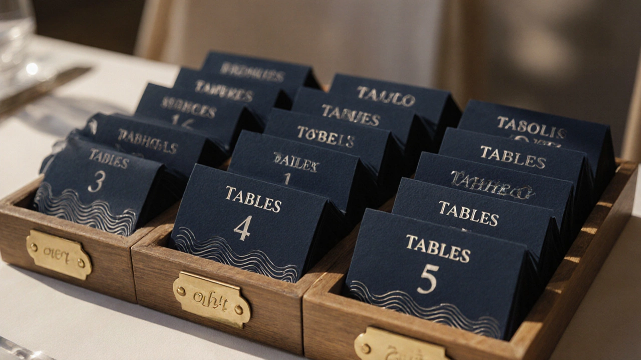
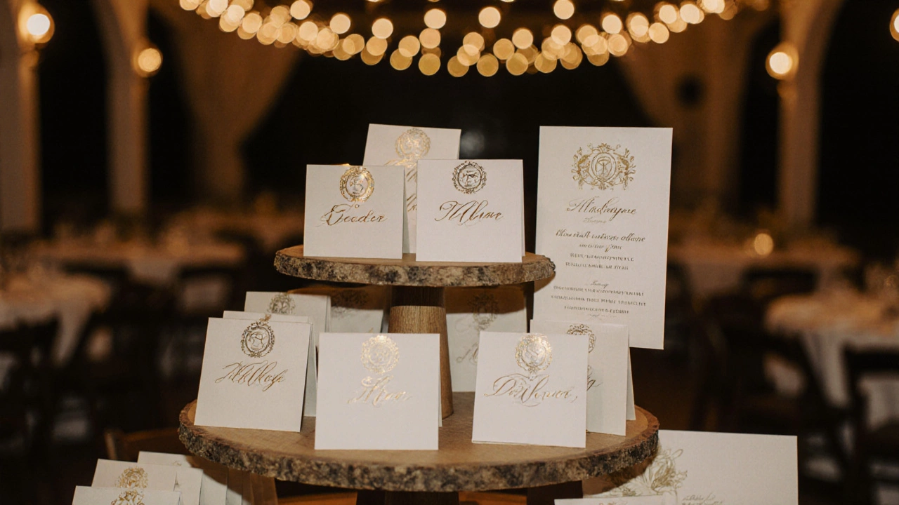
Material and Texture Are Silent Signals
Cardstock isn’t just paper. It’s a sensory cue. A thick, textured card feels expensive. A thin, glossy one feels cheap-even if the design is beautiful. For weddings, aim for 110 lb or heavier cardstock. That’s the sweet spot: sturdy enough to stand on its own, thick enough to feel luxurious.
Consider finishes. Matte gives a modern, understated look. Velvet-touch adds warmth. Metallic foil (gold, rose gold, copper) adds elegance without being flashy. If your invitations have a debossed logo, replicate that on the cards. Texture tells people, “This was made with care.”
Avoid glitter. It’s messy, hard to clean, and doesn’t photograph well. And no handwritten names unless you’re a professional calligrapher. Even then, handwriting looks great on 10 cards-not 120.
Organize for Flow, Not Just Looks
How you display the cards affects guest experience. Don’t just dump them in a pile. Group them by table. Use a wooden tray, a vintage bookshelf, or a tiered stand. Label each section with a small sign: “Table 1-4,” “Table 5-8,” “Table 9-12.”
Put the cards in alphabetical order within each table group. Guests won’t know their table number until they find their name, so sorting by name makes it easier to scan. If you have 12 tables, you’ll have 12 clusters. That’s manageable. If you have 20 tables? Consider using color-coded ribbons or small flags to separate groups.
Place the cards near the entrance, but not right next to the cocktail bar. You want guests to find them before they start drinking. A quiet corner with good lighting is ideal.
Test Before You Print
Print a test batch. Not a digital proof. A real printed sample. Hold it in your hand. Put it on a table. Step back. Can you read the table number from two feet away? Is the font too thin? Does the paper feel flimsy? Does the color match your invitation under natural light?
Do this at least 48 hours before your final print run. If you’re using a printer, ask for a physical proof. Online vendors like Minted, Zazzle, or local print shops will often send one for free if you ask. Don’t skip this. A $10 test print saves you $500 in reprints.
What to Avoid
- Using too many fonts (three or more looks chaotic)
- Printing names in all caps (hard to read, feels aggressive)
- Using a font smaller than 12-point for names
- Forgetting to include table numbers (yes, this happens)
- Using fragile materials like vellum or tissue paper
- Handwriting every card unless you’ve practiced 50+ times
- Leaving out the couple’s names or wedding date (some guests need context)
Real Example: A Perth Wedding
Last year, a couple in Fremantle used navy blue cardstock with white foil lettering. Their invitations had a subtle wave pattern, so their escort cards had the same embossed line along the bottom. They grouped cards by table in small wooden trays, labeled with brass tags. Each tray held 10 cards, alphabetized. Guests found their names quickly. No one was lost. One guest later said, “I didn’t even realize how thoughtful it was-until I realized I never had to ask anyone where to sit.”
Final Tip: Make It Part of the Story
Your escort cards are the last thing guests interact with before the reception begins. They’re the bridge between the ceremony and the celebration. When they match your seating chart in design, layout, and feel, they don’t just inform-they elevate. They say, “We didn’t just plan this event. We cared about how it felt.”
That’s the difference between a good wedding and one people still talk about a year later.
Do escort cards need to match the wedding invitations exactly?
They don’t need to be identical, but they should match in style, font, texture, and color palette. If your invitations are modern and minimalist, your escort cards shouldn’t be ornate and floral. Consistency in design language makes the whole wedding feel intentional, not random.
Can I use digital escort cards instead of physical ones?
Digital escort cards-like QR codes on a screen or an app-are possible, but they’re not ideal for most weddings. Many guests, especially older ones, prefer something tangible. A physical card is easier to hold, keeps as a keepsake, and doesn’t require tech. If you do go digital, always have a printed backup for guests who struggle with screens.
How far in advance should I order escort cards?
Order them at least six weeks before your wedding. Printing and shipping can take 2-3 weeks, and you’ll need time for proofs, corrections, and last-minute name changes. If you’re doing custom calligraphy or foil stamping, give yourself eight weeks.
What if I don’t know all my guests’ names yet?
Wait until your RSVPs are finalized-usually two to three weeks before the wedding. If you’re missing a few names, leave blank spaces and fill them in by hand with a fine-tip pen. Use the same font style as the printed cards. Avoid printing with placeholders like “Guest of John Smith”-it looks lazy.
Should I include table numbers on the escort cards?
Yes, always. The whole point of an escort card is to tell guests which table to find. If you only include names, guests will still need to ask someone where their table is. That defeats the purpose. Make sure the table number is clear, large, and easy to spot.