Wedding escort cards aren’t just functional-they’re the first impression guests have of your reception’s vibe. If your table decor uses soft blush roses and gold candlesticks, but your escort cards are bright neon green, it throws off the whole mood. The right color palette ties everything together without shouting. It’s not about matching exactly-it’s about harmonizing.
Start with Your Table Decor
Before you pick a single hue for your escort cards, look at your table setup. What’s already there? Linens? Centerpieces? Chargers? Glassware? These elements form the foundation. A navy velvet table runner with silver mercury glass vases? That’s your cue. Your escort cards should echo those tones, not fight them.
Take a photo of your actual table decor under the same lighting you’ll use on the wedding day. Then open it in any free image editor-like Canva or even your phone’s gallery app-and use the color picker tool. Zoom in on the fabric, the flowers, the metallic accents. You’ll often find three to five dominant colors you didn’t even notice. Those are your palette.
Three Winning Color Palettes That Work
Here are three real-world combinations that consistently look polished and intentional.
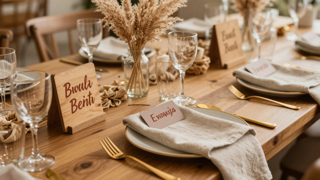
- Earthy Neutrals + Terracotta: Think linen napkins, wooden signs, dried pampas grass. Pair escort cards in soft oatmeal or warm taupe with lettering in deep terracotta. Use a matte finish to avoid glare under string lights. This combo feels grounded and romantic, not fussy.
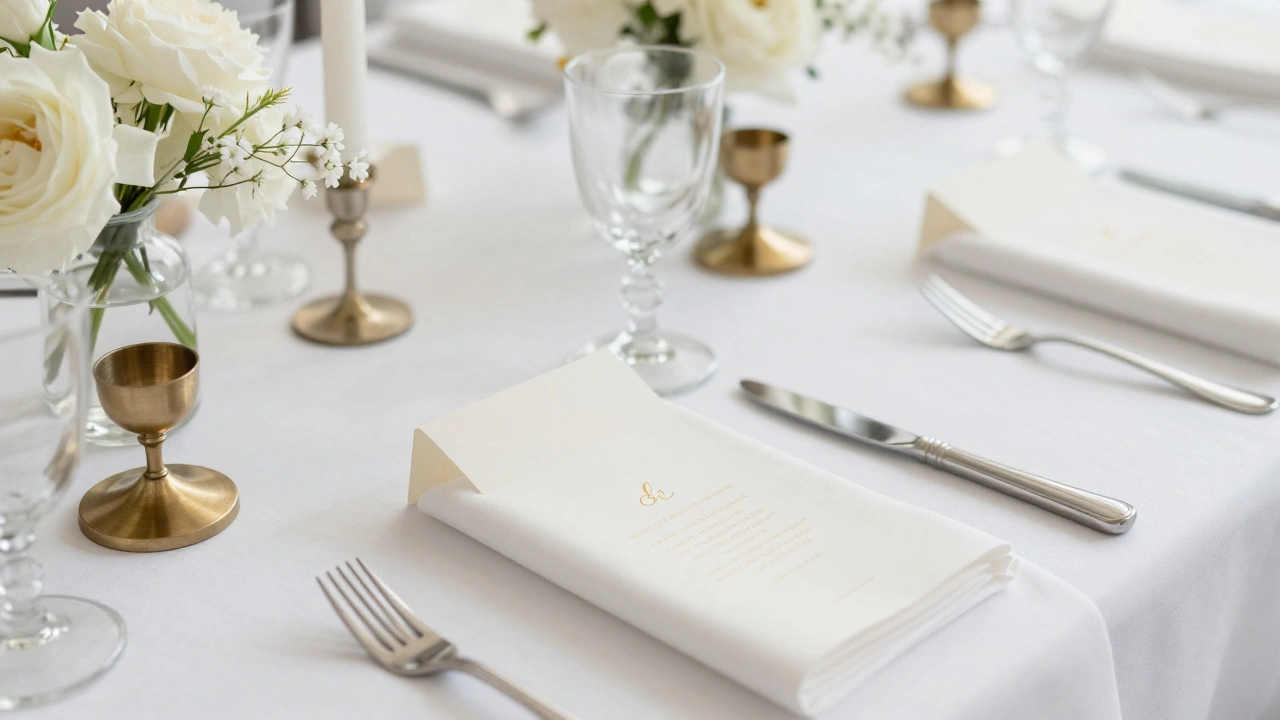
- Soft Monochrome with Metallic: If your tables use white linens, clear glass, and brushed brass candle holders, go for escort cards in ivory or pale gray. Print the names in brushed gold foil or deep charcoal. The contrast is subtle but luxe. Avoid pure white cards-they look cold next to warm metallics.
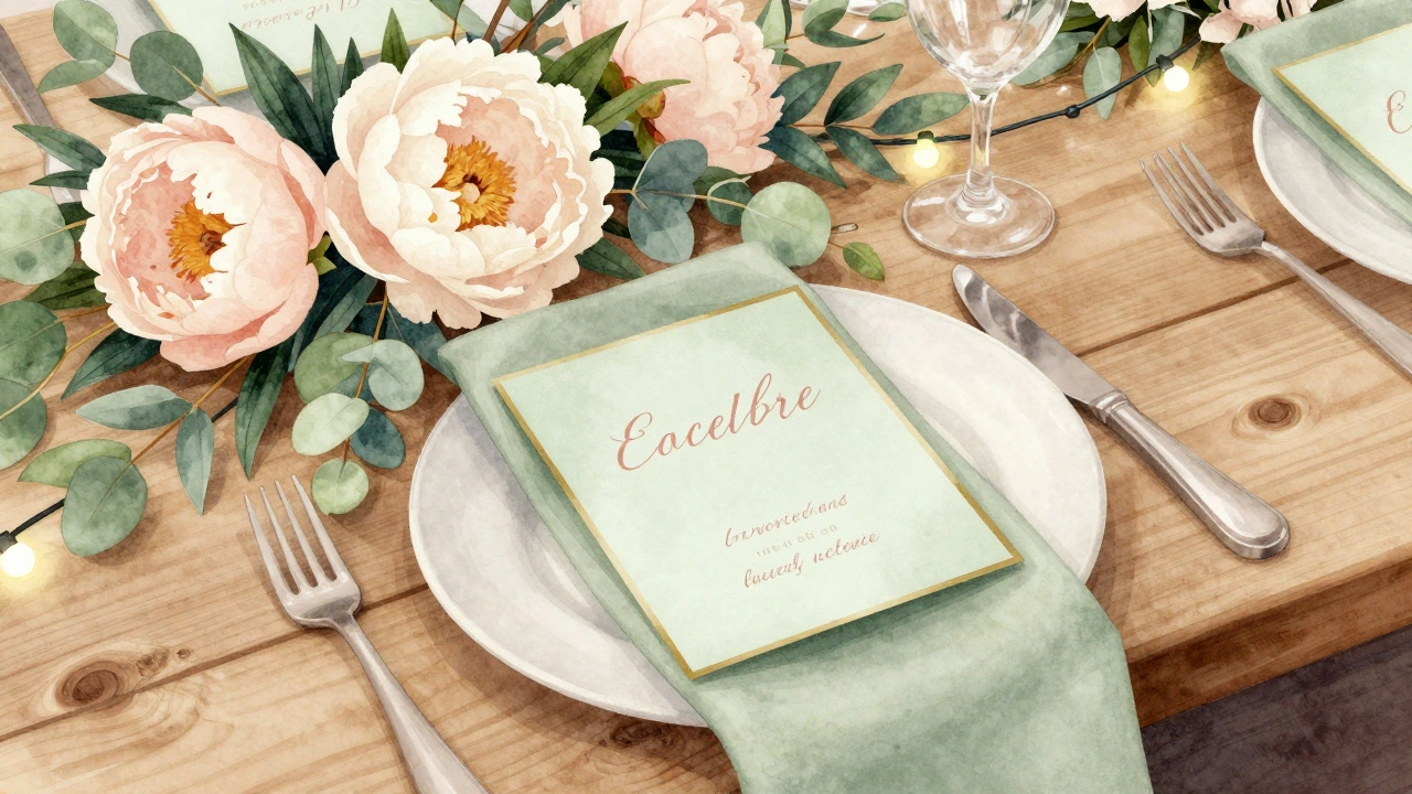
- Blush + Sage + Gold: A classic for spring and summer weddings. If your centerpieces include eucalyptus sprigs and blush peonies, use escort cards in a muted sage green. Write names in soft blush with a thin gold border. The green grounds the pink, and the gold ties back to your flatware or signage.
Avoid These Color Mistakes
Some combinations look great in theory but fall apart in real life.
- Neon on neutrals: A bright coral card against a beige tablecloth? It looks like a mistake. Neon colors don’t blend-they dominate. Save them for party favors, not escort cards.
- Too many competing tones: If your table has five different colors (purple linens, turquoise napkins, yellow candles, green florals, and red accents), don’t try to include them all in your cards. Pick one dominant color and one accent. Less is more.
- White cards with white paper: If your table has white linen and white charger plates, white escort cards vanish. Use a cream, a light gray, or even a pale mint. Give your guests something to see.
Texture Matters as Much as Color
Color isn’t just about hue-it’s about surface. A glossy card feels modern. A textured cardstock feels handmade. A card with a subtle linen finish feels expensive. Match the texture to your table’s vibe.
If your centerpieces are smooth glass and polished silver, go for a sleek, matte card. If your tables have burlap runners, hand-painted ceramics, and woven placemats, choose a card with visible fiber or a soft, cotton-like feel. The texture should feel like it belongs on the same table.
Don’t underestimate the power of edge detailing. A gold foil edge on a cream card? It catches the light just enough to draw attention without being flashy. A deckled edge on a kraft paper card? It adds rustic charm without looking cheap.
Lighting Changes Everything
That perfect peach card you picked in daylight? It might look muddy under warm reception lighting. Always test your colors under the actual lighting you’ll use. Most venues use LED or tungsten bulbs-both shift colors differently.
Ask your venue if you can visit during the evening before the wedding. Hold your card next to your table decor under the real lights. Does the color still feel right? Does the lettering stand out? If not, adjust. A slightly deeper tone often reads better under low light.
Fonts and Lettering Should Complement, Not Clash
The color of your ink matters just as much as the card. If your cards are a deep charcoal, don’t use black ink-it disappears. Use white or cream instead. If your cards are ivory, avoid light gray ink. It blends in too much.
For metallic lettering, use foil only if your card stock can hold it. Thick, textured paper works best. Thin cardstock can warp under heat foil. If you’re printing digitally, choose a rich, saturated color that mimics foil-like a deep burgundy instead of red, or a muted gold instead of yellow.
Real Example: A Wedding in Sonoma
Last summer, a couple in Sonoma used olive green linen napkins, terracotta ceramic vases, and dried lavender in their centerpieces. Their escort cards were made from recycled paper in a warm clay tone-almost like sunbaked earth. The names were printed in a deep forest green with a thin copper foil border. The copper echoed the rim of the vases. The green matched the napkins. The clay tone tied to the pots. Guests didn’t notice the cards were designed-they just thought everything felt ‘right’.
What to Do If You’re Still Unsure
Create a simple mood board. Take four to six swatches of your table decor materials-fabric, flowers, glass, metal-and lay them out. Then lay your top three card color options next to them. Step back. Which one disappears? Which one pulls your eye away? Which one feels like it was always meant to be there?
Ask someone who isn’t involved in the wedding to look at the board. Say: ‘Which one looks like it belongs?’ Their gut reaction is often more accurate than your overthought decision.
Final Tip: Print a Test Batch
Don’t order 100 cards without testing. Print five samples. Put them on a mock table with your actual linens, centerpieces, and lighting. Take photos. Zoom in. Hold them in your hand. Move them around. See how they look from six feet away.
If you’re still hesitating, go one shade darker or one tone warmer. It’s easier to fix a card that’s too light than one that’s too bold.
Can I use different colors for different sections of escort cards?
Yes, but only if your table decor has clear groupings. For example, if you have separate tables for family, friends, and coworkers-and each has a slightly different color scheme-you can match each card group to its table. But keep the style consistent: same font, same size, same texture. The variation should feel intentional, not random.
Should escort cards match the invitation suite?
Not necessarily. Your invitations set the tone for the whole wedding, but your escort cards are part of the reception decor. It’s fine if they use a subset of the invitation colors or even a completely different palette-as long as it complements the tables. Many couples use invitations in deep navy and gold, then switch to blush and sage for escort cards because that’s what their florals and linens use.
What’s the best paper weight for escort cards?
Go for 110 lb to 130 lb cardstock. Anything lighter feels flimsy and can bend in humidity. Heavier paper holds up better when guests pick them up, and it feels more luxurious. If you’re using foil or embossing, 120 lb is the sweet spot-it’s thick enough to hold detail without warping.
Can I use digital printing instead of letterpress?
Absolutely. Modern digital printing can mimic letterpress with high-quality matte or textured papers. You can get rich color saturation, fine detail, and even simulated foil effects without the high cost. Many designers now use digital for escort cards because it’s more reliable for last-minute name changes and smaller batches.
How far in advance should I order escort cards?
Order them at least six weeks before the wedding. If you’re using custom printing, foil, or hand-lettering, give yourself eight weeks. Printing delays happen. Paper shortages happen. And if you need to reorder because of a typo, you’ll be glad you planned ahead.
If your table decor feels like a scene from a movie, your escort cards should feel like a quiet detail that makes the whole moment click. Not loud. Not flashy. Just perfectly in place.