Color Palettes for Wedding Cards: Trends, Tips, and Design Ideas
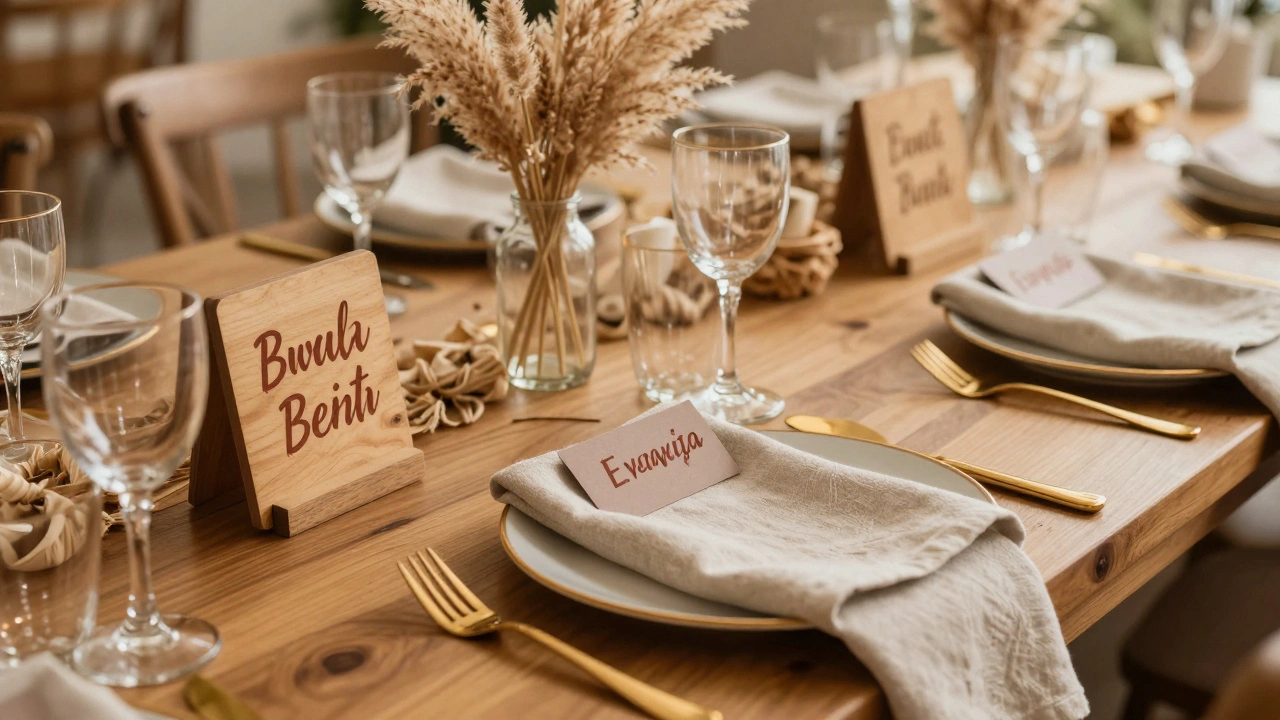
When you think about color palettes for wedding cards, a set of harmonious colors chosen to reflect the tone and style of a wedding. Also known as wedding color schemes, they’re not just about looks—they guide how guests feel before they even sit down. These colors tie everything together: the invitations, the table numbers, the menus, and yes, the wedding escort cards, small cards that tell guests where to sit at the reception. Get the palette wrong, and your seating area looks messy. Get it right, and it feels intentional, polished, and personal.
It’s not just about picking your favorite shades. You need to think about contrast, lighting, and how the colors play with other elements. A soft blush and gold palette works beautifully with printed cards on thick paper, but it can disappear under bright reception lights. Dark navy and emerald? Bold and elegant—but only if the text is clear enough to read from a few feet away. That’s why so many couples now match their escort card colors to their wedding stationery, the full set of printed materials used in wedding planning, from invites to place cards. If your invite uses sage green, your escort cards should too. Consistency builds trust and calm for guests who are already navigating a big day.
And it’s not just paper. Think about the display. Wooden boards, glass trays, hanging lanterns, or even a living wall—all these surfaces change how color looks. A dusty rose might glow under string lights but turn muddy under fluorescent bulbs. That’s why real wedding planners test their palettes in the actual venue, at the same time of day the reception starts. You don’t want to surprise your guests with a color that looks nothing like the photos.
Today’s trends are leaning into earthy tones, muted pastels, and even monochrome schemes with texture doing the talking. But the best palette isn’t the trendiest—it’s the one that fits your story. Are you having a rustic barn wedding? Think warm terracotta and cream. A modern city reception? Try charcoal and metallic silver. A beach wedding? Soft seafoam and sandy beige. Your escort cards are tiny, but they’re the first thing guests interact with when they walk in. They set the tone for the whole night.
And don’t forget accessibility. High contrast between text and background isn’t just good design—it’s necessary. White text on light yellow? Hard to read. Black on deep purple? Better, but check the lighting. Some couples now add subtle QR codes to their cards for digital directions, and those screens need color schemes that work on phones too.
Below, you’ll find real examples of how couples nailed their color choices—from eco-friendly recycled paper with natural dyes to bold, modern combos that turned heads. You’ll see what works with different venues, seasons, and guest experiences. No fluff. Just practical ideas you can use, tweak, or ignore—because your wedding should look like you, not a template.
- Dec, 4 2025
- 0 Comments
Wedding Escort Card Color Palettes That Perfectly Match Table Decor
Choose wedding escort card colors that blend with your table decor for a cohesive, polished look. Learn which palettes work best and how to avoid common mistakes.
read more