Readable Escort Cards: Design, Etiquette, and Practical Tips for Weddings and Beyond
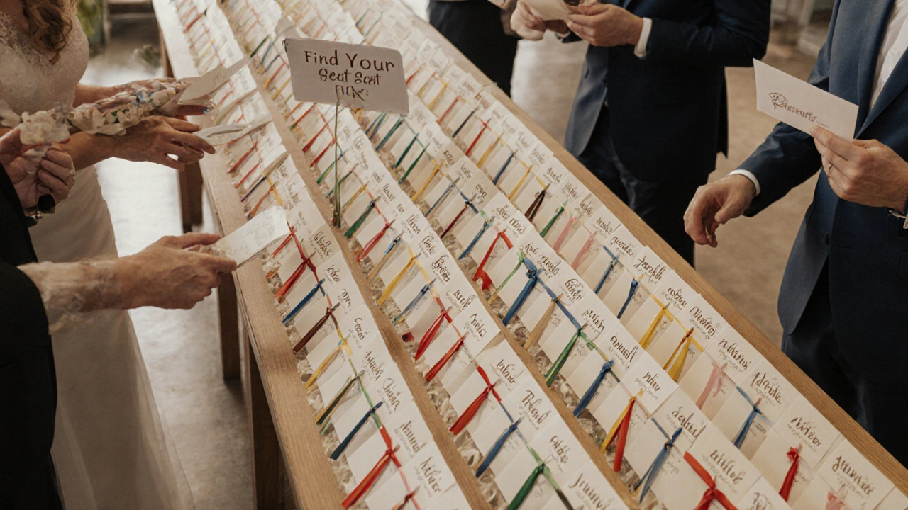
When you think of readable escort cards, small, clear cards that guide guests to their seats at weddings or events. Also known as seating cards, they’re not just decoration—they’re the quiet backbone of guest flow. If your guests can’t read them at a glance, you’ve missed the point. It’s not about fancy foil or intricate calligraphy. It’s about legibility, placement, and timing. A card that looks beautiful but forces guests to squint or hunt for their name defeats the whole purpose.
Readable escort cards rely on three things: font size, contrast, and spacing. Anything under 14-point type is risky, especially under string lights or in outdoor settings. Dark ink on light paper works. White text on black? Only if it’s huge. And don’t cram names and table numbers into a tiny rectangle—guests need room to breathe. This isn’t just about looks; it’s about reducing stress. Imagine a guest rushing to find their seat before dinner starts, squinting at a card that looks like it was printed on a postage stamp. That’s not elegant. That’s frustrating.
There’s also the matter of escort card etiquette, the unwritten rules for how names, titles, and plus-ones are written on cards. Should you use first names only? What if someone’s married but keeps their last name? Do you write "Mr. and Mrs. Smith" or list both full names? Getting this wrong can cause awkward moments—or worse, hurt feelings. The best approach is simple: match how the guest signed their RSVP. If they wrote "Sarah Jones," don’t turn it into "Mrs. John Smith." Clarity beats tradition every time.
And it’s not just about weddings. wedding stationery, the full set of printed materials from invites to thank-you notes sets the tone. Your escort cards are part of that story. If your invites are modern minimalist, your cards shouldn’t be ornate Victorian. Consistency matters. It tells guests you paid attention—not just to style, but to their experience.
Weather matters too. Outdoor weddings? Paper curls in humidity. Ink smudges in rain. You need materials that hold up—thick cardstock, waterproof coatings, or even acrylic holders. A single gust of wind shouldn’t send half your guests scrambling for their seats. Real-world solutions exist: laminated cards, metal stands, or even digital displays synced to your seating chart. It’s not about going high-tech—it’s about being prepared.
And timing? Don’t wait until the week before to order them. Printing delays happen. Guest lists change. Last-minute additions mean last-minute stress. The best time to order? Three weeks before the event. That gives you room to tweak, print, and double-check every name. No one wants to be the bride who’s hand-writing cards at 2 a.m. the night before.
What you’ll find below are real guides from people who’ve been there. How to match your cards to your seating chart without chaos. What printing techniques actually look good without breaking the bank. How to handle kids, plus-ones, and tricky titles without drama. And yes—even how to make them readable when the wind’s blowing and the sun’s glaring. These aren’t theory pieces. They’re field-tested tips from couples, planners, and designers who know what works when it counts.
- Nov, 29 2025
- 0 Comments
Accessibility Tips for Wedding Escort Cards: Readability and Placement
Make sure every guest finds their seat with ease using clear fonts, high contrast, smart placement, and inclusive design for wedding escort cards. Accessibility isn’t optional-it’s essential.
read more